When I look at The Pertwillaby Papers, I can’t help but think of Aaron Sorkin. Aaron Sorkin created and wrote The West Wing, one of my favorite shows, and is well known for packing every episode with wall-to-wall dialogue. Upon finishing the show for the first time, I was eager for more of his work, and found his first show: Sports Night. It was a critically acclaimed sitcom from the same creative team of Thomas Schlamme and Aaron Sorkin, but cut short two seasons in to its run. And when I popped it in, I was shocked!
Exchanges I saw on The West Wing had originally appeared in Sports Night, having been re-purposed in a different context. Scenes, speeches, subplots, all lifted from The West Wing’s predecessor, as though Sports Night had only been a rough draft. Sometimes Sports Night had the better take, though more often The West Wing did. But whenever I saw that kind of lift, I couldn’t help but marvel, not just at the brazenness of stealing from yourself, but the way context and execution can completely alter an idea even from the same author.

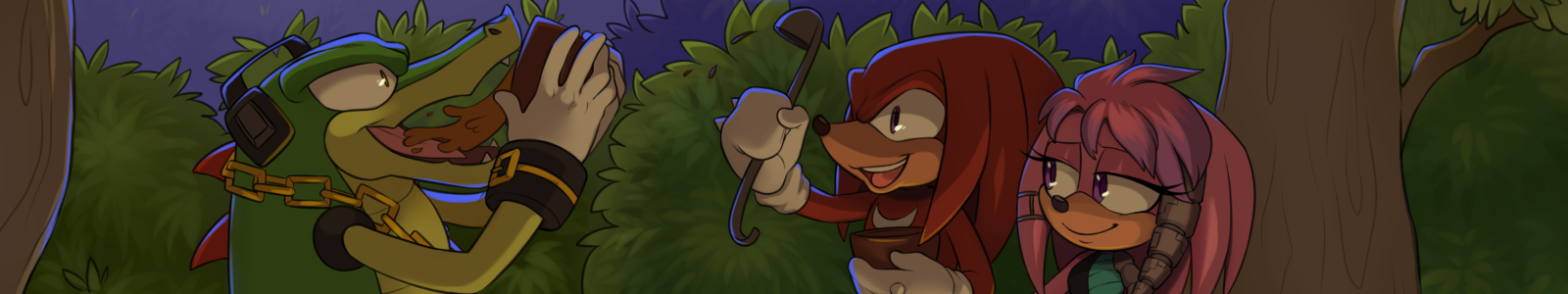
You can see why The Pertwillaby Papers is fascinating from that perspective alone. Don Rosa has openly admitted that Lost in (an alternative section of) the Andes was at heart an Uncle Scrooge story, and later rewrote it as Son of the Sun, his very first Duck story. Stories, characters and jokes from The Pertwillaby Papers are shamelessly used for his Duck stories, sometimes made better, sometimes made worse. I purchased the books as a matter of curiosity, and much of my joy reading it was playing the same game I do when I watch Sports Night.
But there are many who adored The Pertwillaby Papers before Rosa ever did Son of the Sun, and I think it’s worth examining from that perspective. For that reason, I won’t be comparing it to his Duck work in this review. It deserves that.
So let’s talk about the collection of this beloved adventure comic by my favorite comic book creator.
(Episode #1-65) Untitled: This story (not even retroactively given a title) introduces the main cast, with a storytelling style closer to the traditional four panel gag-a-day newspaper comic than the adventure series it would become. Based around the premise that Lance is trying to make his way through college without official enrollment or tuition, and villains Smyte and Roatch attempting to expose him through petty revenge, the college setting allowed for a great cast of characters and humorous scenarios.

What’s particularly notable about this section for me are some of the different ways Rosa told the story. Some strips didn’t feature the main cast at all, instead allowing side characters to get a ‘scene’ to themselves. This created a more fully populated world, rather than the barren vacuum world most newspaper casts exist in. The vertical recap panel for each strip was a genius way of conserving space and minimizing “As you know”s in the dialogue, and of course, the use of personalized speech bubbles helped to give more personality to the characters in this limited space.

While the art may have been a more amateurish Rosa, it is still Rosa, best evidenced by the anti-abrasium sequence. It may not be Rosa’s favorite, but I think this is the funniest of the Pertwillaby Papers tales.
(Episode #66-127) Lost in (an alternative section of) the Andes: In this second story, most famous for its adaptation to The Son of the Sun, Lance Pertwillaby seeks out the temple of Manco Copac. And wow, what a difference from the first story! Not only was the focus changed to action/adventure, everything, from the art, the lettering, the layouts, the pacing, even the recap panels were elevated far beyond that first story. Take a look at this plane crash to see what I mean:

All that in the span of a four-panel sized newspaper strip. Brilliant.
One of the great advantages of the four-panel format is its brevity. There’s a sequence at the beginning which is entirely exposition, but beyond that, the story keeps moving forward, with each strip admirably attempting to stand alone while still building towards the iconic climax. And at 61 strips, the story never feels like it’s wearing out its welcome. It is an extremely well-executed piece of comic storytelling. And despite my affection for the later tales, I believe that this is the best story of the Pertwillaby Papers, devoid of filler or over-complication. Why the comic didn’t end up in syndication upon Rosa’s graduation I will never, ever know, because I would love to have seen Rosa progress as an artist in this medium.
(Episode #128-133) Sub-Zero: After leaving college, The Pertwillaby Papers was revived in a serialized comic book format. The episodes (as he titles each strip/installment) became 10-15 pages, and he clearly relished the opportunity to cram as much as humanly possible in to every panel. The dialogue, character designs, set pieces, sequences all became far more elaborate and detailed, showing what Rosa could really do if he had a chance. And seeing the difference blew me away.

The story was a three-way race through the Arctic, with murder, betrayal, Nazis, and the occasional poop joke. Sub-Zero marked the comic’s first stabs towards suspense, and pushing more towards black comedy. Each episode moved the story towards a grand climax, reading like a story broken up in to six installments, while still being a largely readable entity on its own. No easy feat in the short span of time he had to tell the story in each episode! But while I might be a fanboy, I’m not a blind fanboy, and I did see problems with the story.


The first being what you see above: The recaps at the beginning of each installment. They’re delivered by the characters rather than captions, and it is a frustrating reading experience: this method makes an effort to treat every reader as though it were the first time they’d ever picked up the magazine, which I understand, but it wastes space on the page and is tedious to read. No new information, story elements, or character information are revealed within these recaps, and I had to stop myself from skimming over them the first time through. While the one you see above made an effort to inject humor in to the process, it’s still a daunting read. With careful application of caption boxes, it would have read more smoothy and allowed for more of the story to be included in each installment.
The second, and I’m hesitant to say this because of the time it was written, is that the characters are not particularly well developed. I can’t tell you very much about them or their personalities, and this is especially problematic with Lance – the main character. There’s very little about him outside of his obliviousness, verbosity and preference for milk, which makes him a more flat and reactive character. This isn’t a great way to get jokes out of a character, or draw in the audience.

The comic isn’t designed to delve in to the psyche of the characters it’s portraying, and that’s fine, but without some character motivation it’s very easy to feel disconnected from Lance. Sub-Zero is still a quality piece of storytelling, especially for its time, managing to take a complex story better suited to a movie and make it play in a comic book format. There are a number of great, memorable moments throughout, and it ends just as it should.
(Episode #134-138) Vortex: I’m going to take a minute here to just show you a page of Sub-Zero…

And a page from Vortex.

I can only assume that during the writing of Sub-Zero, Rosa was saving up to buy the gallons of black ink he’d end up using in his take on a journey to the center of the earth. Vortex is gorgeous, and my mouth was hanging open from the painstakingly detailed artwork. For me, that alone would have been worth the price of purchase.
While Sub-Zero was telling one story across six installments, Vortex better utilized the serial format by writing each episode as a distinct entity in and of itself, lending a uniqueness to each installment that made the comic more varied and interesting. Each episode still advanced the overall plot, was enjoyable as a piece of storytelling taken by itself, and ended with a cliffhanger for the next episode. While that may not sound like much of a difference compared to Sub-Zero, it’s actually much closer to the newspaper format The Pertwillaby Papers was born from, extrapolated to comic book form to great effect.
And you have no idea how much better Vortex reads because of these changes. It can still feel its length sometimes, but no one ever said you have to read the whole thing in one sitting. If there are any comic writers reading this, I suggest you steal liberally from the way he tells this story.
(Episode #139-141) Knighttime: Moving away from the varied format of Vortex, Lance and company find their way to the time of King Arthur. Knighttime is an unfinished tale (though he reveals how it would have ended in an interview), spanning only three episodes, and it’s a real shame. The Pertwillaby Papers had the option of continuing through Fantagraphics in the form of graphic novels, but it appears Rosa chose to work on Captain Kentucky instead (why he didn’t ask to do The Pertwillaby Papers as a newspaper comic is a question I ask myself every time I read that collection). That said, Knighttime has great scenes, better characterization for Lance, better staging and layouts… and is oppressively difficult to read.

The sheer amount of text in this story makes me cringe. I can forgive some of Rosa’s quirks from earlier installments, which tended to be text-heavy to keep the plot moving in this short space, but he went way over the line with this last tale. As long as you prepare and pace yourself throughout the story you should be fine, because once you get past the inelegantly written dialogue Knighttime is truly a spectacle. It never stops bringing the funny, and some of the best moments of the series come from these last three episodes. And I have to say, the best cliffhanger Rosa’s ever done was the last panel of the whole series.
Extras
Khulan: This fantasy comic, written by Rich Fay, is pretty weak. It’s Rosa art, which is something, but it’s not very good Rosa art: unsurprising for content produced by two high school juniors/seniors. With the use of prose panels in the vein of Prince Valiant, Khulan proves that not all experiments are successful.

Tagdenah: These two fantasy stories written by Patty Payne, starring the mysterious roaming wizard Tagdenah, are a serious departure from the typical Rosa style of art and storytelling. They are a fascinating look at what might have been if he’d ever developed a permanent partnership with someone. Even the strange style of captions for dialogue works to fit the story’s mood, and I’ve never seen that used correctly before: as much as Rosa bemoans his lettering, the story would have fallen apart with a lesser letterer. Fitting a complete story in to such a small page count, especially a more serious one, is no small feat: I am truly impressed. I would love to have seen more from her.

Bonus Features: Now, I’m in the bonus features, so I’m a little biased. But my interview with Rosa isn’t the only thing there: there’s a cover gallery, an interview with David Campiti, newspaper clippings, convention drawings, previous introductions and other great miscellaneous Pertwillaby content. It’s as complete a collection for The Pertwillaby Papers as anyone could realistically hope to achieve. The only thing missing for me is that Rosa didn’t write new, individual introductions for his Pertwillaby Papers stories, but rather an introduction for the book as a whole, and another for the non-Pertwillaby Papers comics.
Presentation: Absolutely amazing. At an oversized 12.75″ by 9″ and printed on thick, beautiful glossy paper, the artwork is presented with in its full glory, with all the detail as it deserves to be seen. The actual layout of the book by Jano Rohleder is excellent, tucking in as much content as possible. However, I would have preferred the covers be placed at the beginning of each story, and for episodes to be marked by page number in the table of contents. There are also a couple of very minor typographical issues in the text that I’m sure will be corrected in the next printing.
There are, however, some printing errors. The first panel of Sub-Zero has been clipped, possibly from improper scanning, as seen in the comparison between the Fantagraphics and Don Rosa Classics printing.


There’s also a printing error I can’t explain, seen below, though it only occurs in this one spot.
Unfortunately… one thing absolutely does interfere with the reading. 2/3rds of a page from Tagdenah are missing. Editor Jano Rohleder has promised to include a sticker that you can use to re-insert the missing panels, and the error is not present in the digital copy. Despite how it may sound, The Don Rosa Classics are still the most beautifully put together comic compilations I own, and the little faults don’t detract from my undeniable pleasure reading the book.
Final Thoughts: For those of you who know Don Rosa as someone with a talent for Duck comics, you’re right. But he is more than that. He is a comic book writer, penciller, inker, letterer, and cover artist, and whether it’s with Scrooge McDuck or Lance Pertwillaby, he knows how to create great comics. If that’s what you love, this is the book for you.
And if you’re going to get anything out of this review, let it be this: meticulously researched, obsessively detailed in its art and writing, funny, and verbose just shy of a fault, The Pertwillaby Papers is Don Rosa to the bone, and I love it.
The Complete Pertwillaby Papers can be purchased at www.danibooks.de with a little help from Google Translate, with digital copies available from Amazon.com.
Thanks for the kind and extensive review!
Just a quick comment on the flaws: I didn’t know the splash panel of ep. #128 was clipped since that was the way it looked in Don’s original scan and I thought it was supposed to look like this. Don didn’t notice this while checking the book either. I’ll manually remaster it if the book is ever reprinted.
The printing error in the earlier episode appears just in your book. This is an actual printing error, not of the mastering, and seems to have happened in very few instances when the paper had a wrinkle or something. Sorry about this!
The missing top half of the last Tagdenah page, on the other hand, *was* a mastering error (we lost that art in the final pdf proof, I still don’t know why) which will be corrected in possible future printings. I’ve shipped out a replacement sticker and info notte with all books starting in November. Those of you who had their books shipped earlier can request this sticker for free, of course.
As for the three DR Comics & Stories covers, yes, I would have preferred to include them before the individual episodes, too. It would have been much more expensive, though, because one color page means that the whole area (eight pages) has to be printed in color, which would have brought the book to 24 color pages (even though the art is black and white) in the middle plus the additional ones in the end … thus I decided to do a full color cover gallery in the end instead of spreading expensive full color single pages across the book.
Jano, I’m glad you liked it, and thanks for your insight in to the printing process! Here’s hoping that this can help convince more Don Rosa and comic fans in general to check out the digital and physical copies, because I’d love to see the book reprinted.
[…] Features: Unlike The Complete Pertwillaby Papers, I’m not actually in this book… but I can hardly hold that against what they did […]